
Craigslist Redesign
A team project included the Heuristic Evaluation, contextual inquiry, and an alternative design for Craigslist.
Project Detail
Timespan: Feb.2018 - Apr.2018
Team Size: 3 people
My Role
User Researcher
UX Designer
UI Designer
Tool
Axure
Figma
Introduction
Craigslist is the biggest classified advertisements website with high traffic. However, the usability of the website doesn't go with its popularity. In this project, we pointed out several usability issues based on the Heuristic Evaluation principle by Professor Charles Schneider and proposed the solution with suitable design patterns align with users needs.
Project Overview
Problem
Except for addressing the usability issues we found through heuristic evaluation, we also tried to solve the problems users had encountered to enhance the overall experience.


The information design is not effective enough to help users complete their goals.


It's hard to tell if the sellers or buyers are scammers or not.


The contact method of sending emails through the system is overwhelming.
Solution Highlights

Collapsible Cards
We grouped the categories on the home page with cards and applied the progressive disclosure design pattern to show only the popular categories at the beginning.
Profile Page
We suggested adding an optional account feature. With the profile page, users can learn about the activity records of the sellers or buyers for security.
Users could also choose to chat directly on the website to avoid the overwhelming emails.


Listing Categorizing
When selecting the subcategory of a new listing, users can still see the selected main category and easily change the previous choice.
Process

My Contribution
During the user research, we came up with interview questions together. I interviewed two of the participants and collected some reviews through the internet.
During the heuristic evaluation, we discovered the usability issues and brainstormed the solutions. After having the consensuses for our solutions, I converted the sketch of the home page to low fidelity wireframe and then the prototype.
After finishing the project with my team, I designed the visual styling on my own.
Persona


Goals
-
Address the current usability issues
-
Provide the information they might be interested in to increase engagement
-
Reduce the possibility of getting scammed
Evaluation & Redesign
Heuristic Definition
Our Heuristic Evaluation was based on the guideline of Professor Charles Schneider's heuristic definition.


Information overload

The current homepage is full of clickable links displayed at the same time which could increase users' cognitive load. Also, the information hierarchy is not clear enough.
Alternative Design
We separated all the categories into sections with a background color to group them more clearly. We adopted the progressive disclosure design pattern to reduce the shown information. Users could expand the section they are interested in individually.

Invisible element on the calendar

The event calendar on the homepage doesn't show the month which violates the Perceptibility of System State. It also violates the External Consistency because of showing the dates of two months at the same time which is not consistent with the analogous system. In addition, it doesn't comply with User Control and Freedom since users couldn't switch to the other months.
Alternative Design
We added the month on the top of the calendar and arrows which allow users to switch to the next or previous month. The date in next month and before today will show as unclickable to avoid errors.

Invisible signifier on Location Sidebar

The location sidebar on the right side of the homepage is an accordion menu but there is no signifier to show that it's a collapsible content. The structure hierarchy is not clear that users might not be able to distinguish the submenu from the menu.
Alternative Design
We modified it to a drop-down menu and placed it at the bottom of the homepage where the location option usually be.

Poor grouping on Listing Pages

There are some unclickable information of this advertisement below the content area, post id, posted time, and also some clickable buttons next to them. Due to the gestalt principle of proximity, users may think those buttons and information have similar functionality because they are close to each other. It violates the principle of Group like widgets/functions since those buttons and information labels have different functions.
Alternative Design
We grouped the information of the advertisement together, such as the post id, posted time, and the user who posted it. We also grouped the share button and save to favorite button together. And placed them in different areas.

Memory load as emailing to friend


Alternative Design
We used lightbox as the alternative design which provided users the information about the post while sharing it.
After clicking the “email to friend” button on the posting page, the website will jump to a new page to enter the user's email and destination email address. But there is no information that can remind users about the posting. It violates the principle of Recognition rather than Recall because the system should minimize the user's memory load by making actions and information visible.

Irreversible category options


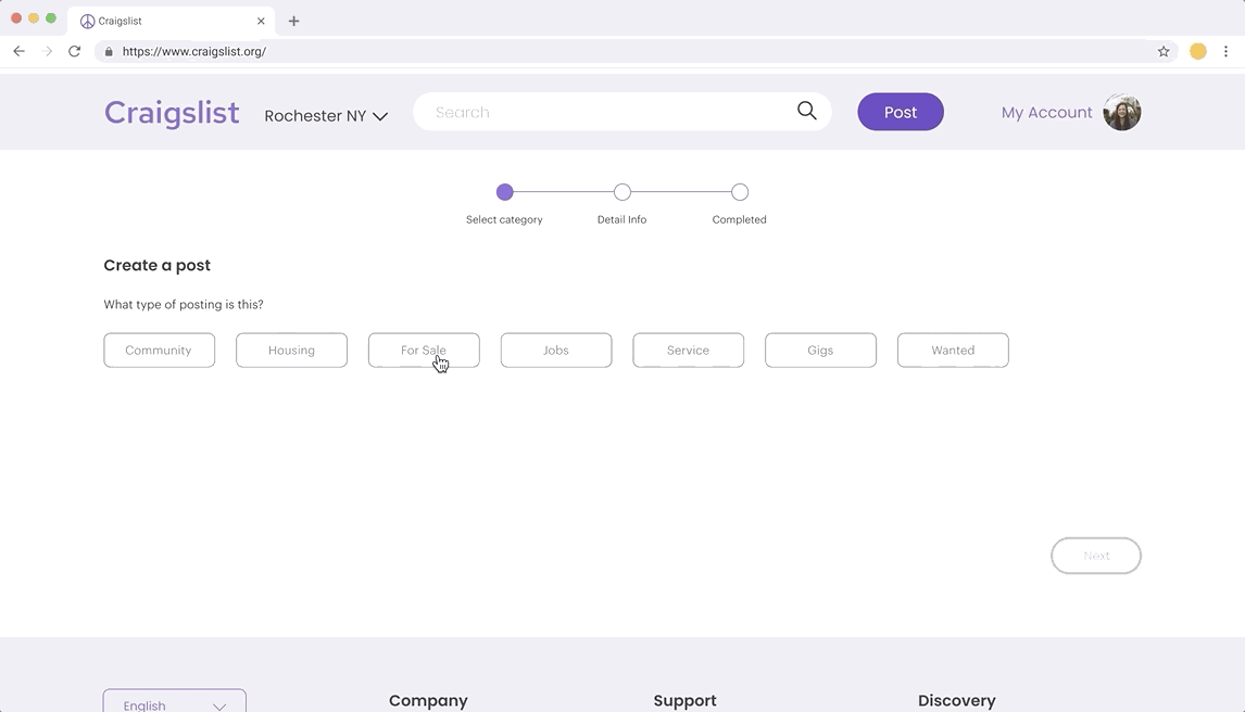
In the posting process, after selecting the category in the first step, the website will jump to the next step immediately without clicking the continue button. Users cannot go back to the previous step and they wouldn’t know which step they are in which. It violates the principle of Error Recovery because the system should help users recover from either system or user errors such as choosing the wrong option. Also, it may increase users’ cognitive load with too many options.
Alternative Design
We used the wizard design to inform users which step they are taking. Also, we only showed users part of the categories to reduce users’ cognitive load. Users could still change the previous option after choosing the next one.

Profile page

We suggested a profile page to show the users' posting history and the reviews of their posting from other users. The page also provides the verified contact methods to secure the safety of trading and the authenticity of the advertising. Moreover, users could communicate directly through the website instead of sending emails.
Guerilla testing
Research Questions
-
What do users expect to see on the website while posting an Ad?
-
Can users complete posting without any help?
Scenario
You are now moving to a new city from Rochester and you don’t want to keep all the furniture with you, so you are trying to sell a second-hand chair on Craigslist. You already have an account.
Usability findings
Unnoticeable Post Button
Some participants pointed out that the post button is not obvious enough in the prototype. The issue has been solved by adding color afterward.
Unclear Login State
During the user test for the first prototype, some participants pointed out that they didn't know if they were logged in or not. We added the user status afterward.
Post without login

Post after login

Final Design
Home page

Login page

Create a posting


Listing page


Profile page
Limitation
Due to the time constraint, we didn't manage to redesign the whole website. The user tests also focused on only one flow with few tasks. More user tests with diverse users are needed to know more about the effect of our designs.