
Accessibility Communication Mobile App — ENY Chat
Designing a speech-to-text app to leverage the communication between deaf and hard of hearing (DHH) and hearing people with user-centered design methods.
| Project Detail
Project Type: User-Centered design
Timespan: Sep.2018 - Dec.2018
Team Size: 3 people
| My Role
Lead Designer
User Researcher
| Method
User-Centered Design
Brainstorming
Interview
Competitive Analysis
User Flows
User Test
Conceptual model
Wireframing
Prototyping
| Tool
Sketch
Paper Prototype
Axure
Design Process

Prompt
Our task for this project is to find an effective design solution that will enhance communication between deaf or hard of hearing and hearing individuals in a professional environment with one or more mobile devices.
Interview
We interview a Deaf or Hard of Hearing (DHH) user as an expert user about her experience of communication with hearing people and sorted several highlights.
I usually use note on my iPhone to type what I want to say and show the others when there's no interpreter.
I've never accessed a speech-to-text app even though I'm aware of the apps and even took part in a project about one of the apps before.
I would not avoid meeting hearing people in person and rather use software to communicate with them.
Asking for an interpreter in advance is always my prior choice if I have to communicate with hearing people.
Based on the interviews and observation, we came up with several ideas:
-
The speech-to-text feature could provide real-time communication as interpreters do.
-
Include the single device mode as using the note app on mobile.
-
Adopt NFC as the connection method between devices to quick access.
-
Include the video chat feature that allows users to perceive others' facial expression
Solution
Design a speech-to-text mobile app to help DHH and hearing users communicate with each other in quick and simple ways under both the conditions of multiple devices and a single device while no interpreters around.
Persona


Conceptual Model
Users will need to log in or create an account before they can start communicating. An account must have an email address, password, and profile picture. Once a user logs in, they’ll be able to start a conversation by sharing a device, or connecting to nearby devices, and send messages wirelessly through the app. Users can join existing conversations through an invitation if they’re near someone already in the conversation, or by entering a code provided by a user currently in the conversation.
Once in the conversation, users will be able to send messages by typing them out or speaking into the app. They’ll also be able to see faces of the other users in the conversation within the app, to more easily pair faces with messages, and so they can read emotions and expression. Users can leave the conversation at any time. Once they leave the conversation, it will be available in a log of recent conversations. From the recent conversation log, users will be able to read the entire conversation within the app, or have it emailed to themselves for future reference.
Functions
Major Functions
Minor Functions
Storyboard
This storyboard focuses on the interaction of a DHH student using the one device feature to have a conversation with a hearing student

The second storyboard focuses on the interaction of joining a group conversation, adding another user, and correcting an error where the speech-to-text system picks up the wrong word.

Task Flow

Design Breakdown
Near-Field Communication(NFC) to join conversation
Design functionality
When opening the app, it’ll give the option to start a conversation by connecting with multiple devices, or by sharing one device. In the multiple device mode, it’ll start checking for nearby devices with NFC. When one or more devices with the app running are detected, the app screen will show the users that are nearby and an option to “start the conversation”. In order to start a conversation, someone will need to select the start conversation option which will move everyone out of the “Searching for devices” mode into a “conversation” mode.
Once the group conversation starts, anyone that wants to join afterward needs to be invited in by a current member of the conversation. This constraint is needed to address privacy concerns and have the users in the conversation feel secure that no one can easily join their conversation. Anyone in the conversation will be able to tap a button to bring up an NFC connection screen that’ll allow them to add the new user in the same way they started the conversation.
Design Evaluation & Iteration

After testing our original prototype, it revealed that “one device” button and the “multiple device” button were not clear ways to label the two approaches of using the app for a conversation. Users did not connect the buttons with the options.
One Device: “have a conversation with one device being passed back and forth”
Multiple Device: “connect to one or more other devices, so each person will be using their own mobile device during the conversation.”
We changed the text of “One Device ” to Single Device Conversation and added an image inside the button to make the meaning clearer. We decided that an image will help the user understand that one device is needed for a conversation with two people. We made sure that the image shows two people using one device.
We changed the text of “Multiple Device” to Group Conversation (up to 5 users) because the word group associates to 2 or more. Since our app is meant to be used for a small group we needed to indicate it can only hold 5 people in a conversation (figure 2). The image also shows multiple users using their own device to help indicate each person will need to use their own device.


After testing the high-fidelity prototype (figure 3), there was still some confusion on how these buttons functioned, and how to start a conversation, despite the addition of images, and the change of language on the buttons. We felt the wording still wasn’t quite speaking the user’s language sufficiently, as we really needed to focus on the action of the user: sharing their phone with someone, or connecting to other user’s phones.
We changed the wording of both buttons, and we decided to switch the order of the buttons, as the “connect to nearby users” option is the focus of the app, and the shared device mode is considered secondary in our design the button.
We also changed the name from “Single Device Conversation (sharing 1 device)” to “Share my Device (sharing 1 device).” We found that users were still not clear on the wording here: one comment during our sessions was that every conversation was “single device” because they were just using a phone.
We also added a text field for manually joining conversations to this main screen, instead of “hiding” that function in the hamburger menu. Although the primary method of joining an existing conversation would be through NFC, we still wanted the “enter a code” method to be quick and easy, and we didn’t want users hunting through menus to find it.

Task Flow

Emotion Capturing: Video Thumbnail
Design functionality
Typical messaging applications (such as Facebook Messenger or Slack) include a profile picture of the user or their initials right next to their message bubbles. We will keep the same concept but the default will be a medium size video thumbnail next to the messaging bubble. This will allow users to see the live, moving faces of their conversation partners next to their messages, so they won’t need to look up and down to check for facial expressions and body language. The screen cannot be taken up just by video like other video chat systems like Skype, Google Hangouts, Zoom etc., but even a small video could give users more information about the emotions and actions of their conversation partners. If a person does not have a built-in camera on their device our app will display their profile picture as a default.
Design Evaluation


The expert users we worked with were enthusiastic about this feature. At each phase of the design, including the low- and high-fidelity prototypes, our expert users gave us positive feedback about the placement of the video thumbnail and understood right away what the video function was intended to do. Because of this, the design remained consistent between the low-fidelity and high fidelity prototypes.
Addressing speech-to-text errors by including an editing feature
Design functionality
The system will automatically flag words that the speech-to-text system has a low confidence in, and will also allow users to tag words that seem wrong during the conversation. To flag a word a user will need to tap the word and a pop up screen will either give two options. The options for the one reading the message will give them the option to send alert to the speaker so they can correct the word. The option for the one speaking will give them the option to correct the word. Once a word is tagged, either because a user has flagged it, or it was flagged automatically by the system, the word will be highlighted for the person who spoke the word. This will draw their attention to the potential error, and allow them to simply tap the word and type out a correction. This will allow anyone relying on reading messages to understand what was said more accurately by the speaker. Only the speak is able to fix the word but people in the conversation can notify the speaker that a word is out of context and.
Design Evaluation & Iteration
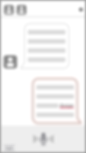

In our testing, users immediately recognized the red line under a word as an indication that there was an error. However, their first inclination for fixing the error was not to simply tap on the word. They thought they should perhaps ask the user what they meant.
Once they saw the list of suggested words, they understood how the interaction worked easily, but agreed it wasn’t clear at first they were supposed to tap on the underlined word.
Since we want it to be quick and easy to fix words that are captured incorrectly, we decided to draw more attention to potential problem words with a popup message that dims the rest of the screen, and instructs the user speaking to make a correction. This screen appears after the system automatically detects a problem.
The text in the popup and the highlighting around the error will make it clear that the user can just tap on the word to make a correction


Task Flow

Conversation with one device
Design functionality
In our interviews, many DHH and hearing individuals mentioned that they will use one device (going back and forth) as a way to communicate. There may be times that a DHH user will want to use this system to communicate with someone who does not have the app installed, or does not have their phone with them.
The single-device conversation mode, constraints for only two users in the conversation. There will be two small icons that users will be able to press on at the bottom of the screen to switch the user before they enter a message. The icon for the device owner will have their initial later as one of the defaults for the icon and the other icon will show “G” guest. After the phone owner sends out the message and hands the phone to the person they wish to speak with, the person could click the guest button to start replying. Their represented icon will then appear next to each message they send, making it clear who said what in the chat history.
Design Evaluation & Iteration

After testing, it seemed like the buttons at the top of the screen to indicate who was speaking, and switch back and forth between “Lindsay” and “Guest” weren’t clear enough.
The intention for the original design was to have the person click on the letter tile at the top of the screen to indicate who was talking. When testing this interaction both users didn’t know what to do in order to switch each user. They kept clicking the letter icon button next to the text-entry box. This icon was intended to help communicate the system state, but wasn’t originally intended to be interactive.
We added a tooltip message to help point out how to switch users, and added buttons to quickly switch users right next to the text-entry box, so it would be easier to get to and have the system align with the user expectations we found in our usability testing.


However, we felt that this process might still be too cumbersome if users were writing short messages and passing the phone back and forth quickly, so we decided on a more significant change: the system could determine when the user had been switched based on the movement of the phone. The buttons to manually switch users were kept, but they would be a backup option in case the automatic system missed a phone hand-off.


When we tested out the high-fidelity our expert users found the tooltip useful. They were able to navigate the bottom two letter buttons that identify who will be talking.
Task Flow

Encouraging one person to message at a time
Design functionality
When observing a group meeting that has a DHH, hearing, and an
Interpreter we noticed that interpreter would tell the group to not
speak all at once. Even when there is not an interpreter we as individual will forget the courtesy of talking one at a time and begin to talk all at once.
If the system detects that too many people are messaging at the same time then the system will shake the screen and display a quick message saying “please let’s not all talk at once”. When the screen shakes no one will be able to send their message, text, or speak their message. While this does not provide a hard constraint of just one person talking at a time, the indicators that someone is entering text via typing or speaking, and the brief halts in conversation enforced by the system when too many people are talking, will nudge users away from talking over each other, making it easier for everyone to follow and participate in the conversation.


This design feature was not evaluated in either the low-fidelity or high-fidelity stages. Due to time frame limitation, we decided that other designs had higher design complexity compared to this one. Which is the reason why it did not make it to the user testing phase.
Our rationale to this decision was that this was a simple design where it communicated straightforward to the user that not everyone should talk at once.
Conversation history visibility
Design functionality
When someone new joins into a group conversation they would be able
to see the messages they missed from the beginning of the conversation. This allows anyone that joins a meeting after it started a chance to read and catch up in what was discussed before they joined. The conversation history would display in dark grey on their screen to keep it distinct from new messages coming in.
This decision and design idea came from the meeting that one of our
team member was in because many DHH and hearing users wanted to have that feature so they do not feel the need to interrupt the whole group for a catch up. Users may also miss a bit of conversation in the few moments it takes to add them to the conversation, and this feature will help smooth that transition as they join the conversation.


This design was not included in our usability tests at either the low-fidelity or high-fidelity prototype stages. Due to time frame limitations, we decided that other, more complex design features should be the focus of user testing. We were confident that users would be able to understand this functionality, as users are used to scrolling up and down to look at older or newer messages.
A required profile picture
Design functionality
When the person downloads the application the first thing the system
is going to ask them to do is to create their profile. To have a complete profile the user is required to upload a profile picture and write their name. These two steps are required before using the application.
By having a picture it helps to put a face to the name and not always guess who might be the person currently messaging. This is beneficial for the groups that are meeting for the first time. The application defaults to video thumbnail but if the user does not want to have a video thumbnail they can switch it to their profile picture. The system will also default to this setting if a video is buffering or lost connection.


This design was not included in our usability tests at either the low-fidelity or high-fidelity prototype stages. Due to time frame limitations, we decided that other, more complex design features should be the focus of user testing.
Our rationale to this decision was that this was a simple design where it communicated straightforward to the user on what was required when creating their profile once they download the app.
Task Flow

Conversation are archived into the application
Design functionality
Once the conversation ends the system archive each conversation for 7 days. Every archived conversation will be named by the time and the location where the conversation was taking place. For security and privacy purposes the archived conversations will be deleted a week from the day the conversation started with no option to recover once it has been removed from the application.
Since the email feature had many positive feedback from DHH and hearing individuals we wanted to have the same concept. Instead of emailing we wanted the system to save the conversation but only for a few days. It allows the user to come back to the conversation in case they missed important information. They also have the option to email it to themselves since the conversation won’t always be in the application.
Design Evaluation & Iteration


After the low fidelity phase of evaluation, we decided not to have an extensive evaluation for this design. Our expert user gave us positive feedback and knew where to find the archived conversation.
Task Flow
